PitchBook re-brand
In 2021, PitchBook launched the rebranding initiative led by my Marketing team and a few lucky contributors. As one of the world leaders in fin-tech and research, we aim to set ourselves apart from the competition. A high-quality product needs to come hand in hand with a visual identity that tells our clients and competitors who we are from the start. Below, you will find the final evolution of the PitchBook brand and my team's efforts to guide us into the next 15 years.
My role
Graphic Designer
Brand Director
Erin Croiser
Visual Design Team
Landan Earley, Claire Teters, Eric Maloney, Jennifer Sam,
Michael Harman, Haley Burson
About the brand
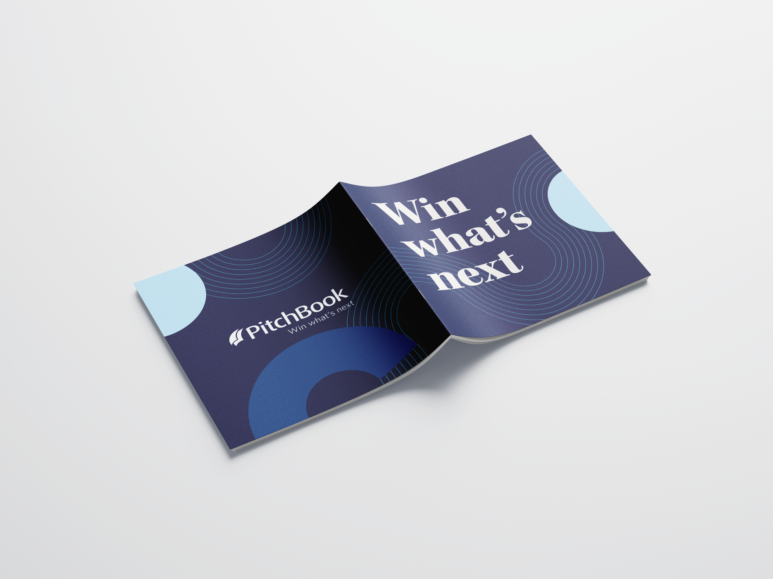
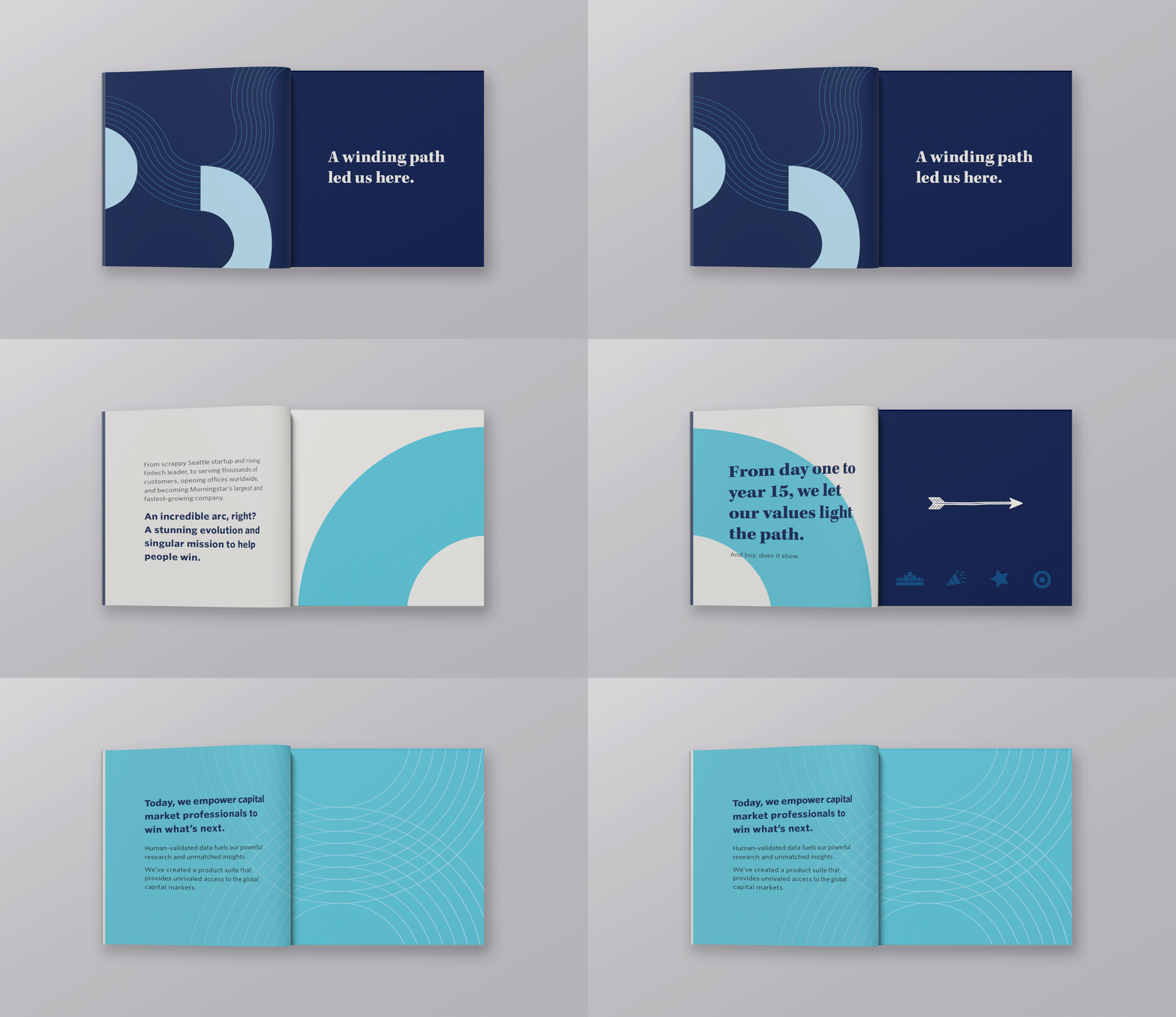
From scrappy Seattle startup and rising fintech leader to serving thousands of customers, opening offices worldwide, and becoming Morningstar’s largest and fastest-growing company.
The next page of PitchBook’s brand story will enable us to
Grow our share of the market and better serve our customers. Reinforce our role as a premier research firm and attract/retain employees to serve our clients with ferocity.
Color
PitchBooks Legacy Blue will always remain part of the brand, but today’s market called for a bit of an update so that we could stand out amongst our competitors. By evolving to a much deeper Navy and paired with eggshell and teal, we created a sophisticated and well-rounded feel to our now more modern brand identity.
Brand Kits
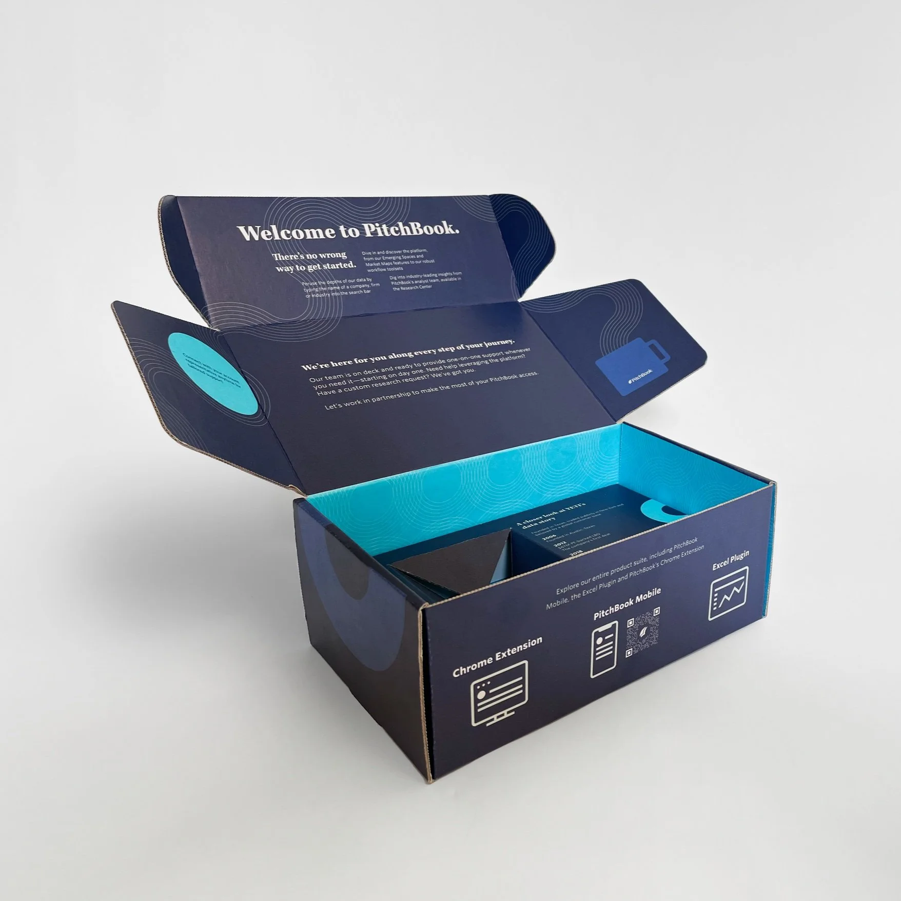
New client welcome kits were one of the first assets the Creative team revamped to reflect PitchBook's #brandevolution. These kits are a key component to CS' onboarding agenda. Thousands are shipped quarterly, and previous analysis found that clients who receive one renew at a higher rate. Redesigning these kits was an opportunity to put the updated brand elements we'd been developing for several quarters into action on an important, high-visibility item.
We wanted the new kits to elevate the experience overall and make it an easy and memorable unboxing for recipients. From a messaging standpoint, we aimed to reinforce that there's no wrong way to get started with PitchBook and that clients have access to robust support at every step of the way.
My role as a designer
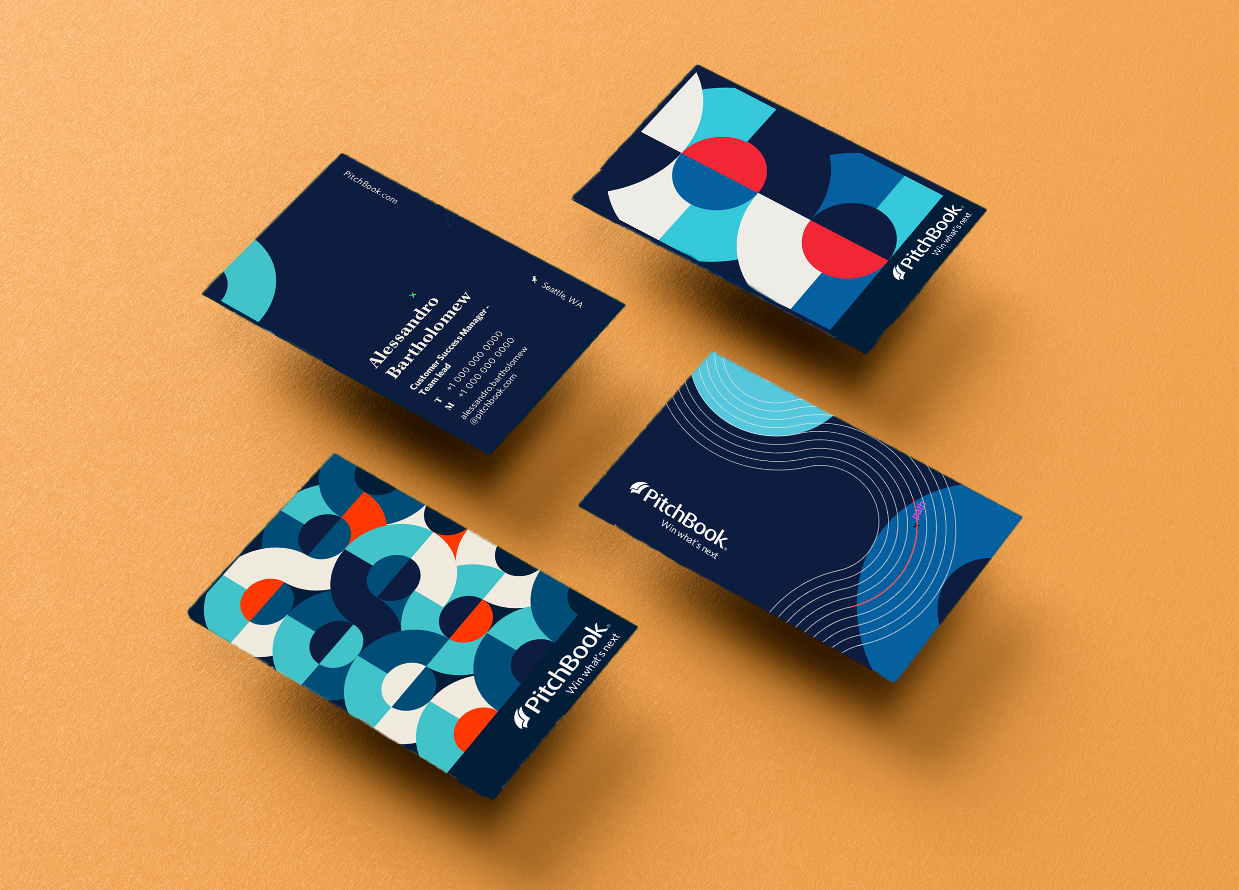
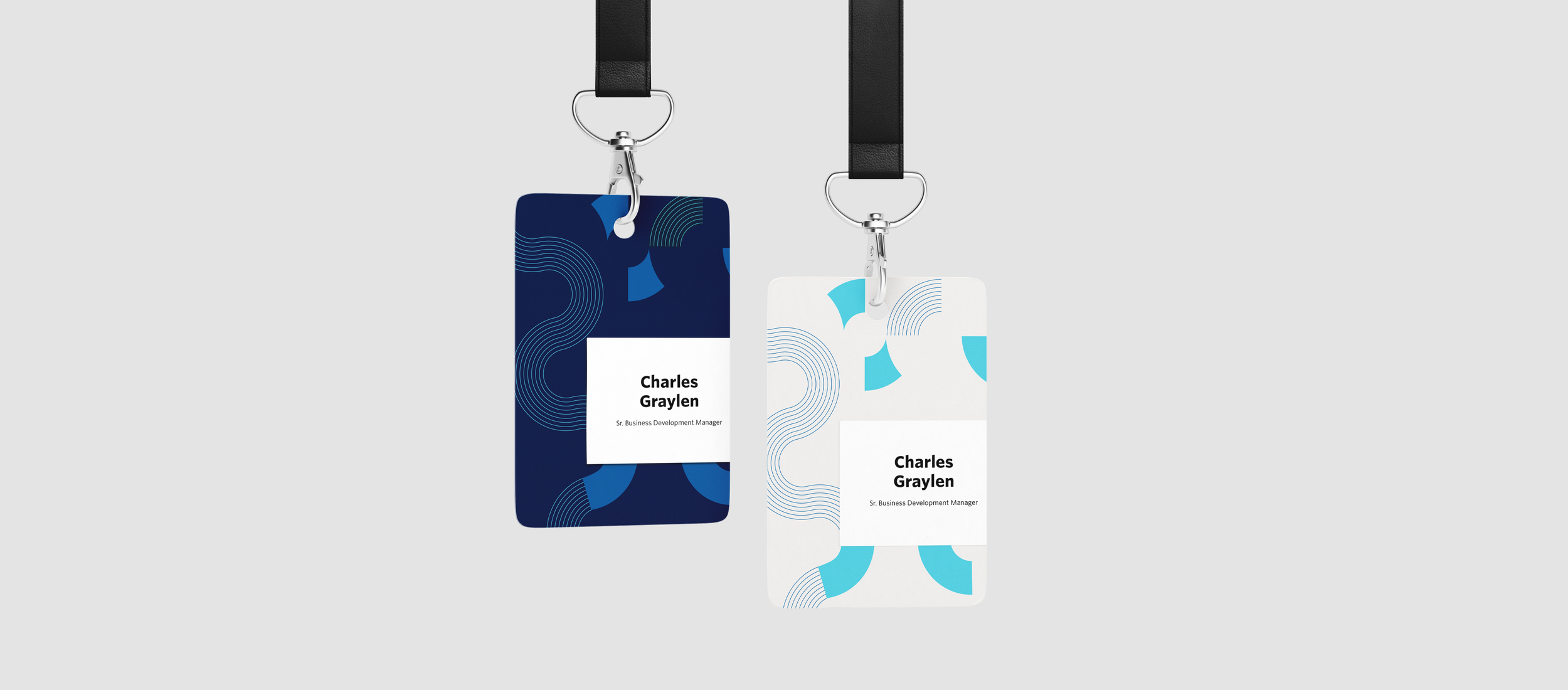
When a company that has been around for 15 years decides to launch a new brand, there are many things that will be changed. I was lucky enough to be the design lead on many physical and digital spaces that needed updating. This included a brand manifesto booklet, event launch, business cards, client welcome packages, employee morale boosters, and much more.
Illustration and Graphic Library
PitchBooks brand evolved from a classic hand-drawn illustration style into a collage-like and highly experiential illustration type. I contributed greatly to developing many assets for the library as well as blog, web, and event illustrations. This unique style is used to help us stand out in the market. To match the collage style, we also leaned into these rounded shapes called “pathways” that light and guide the way to knowledge.
Conclusion
As of 2024, this has been PitchBooks design Library and is pulled through all ends of design. I have played a major role in this brand identity by art directing, creating new content, and designing fit for PitchBooks ’ needs. I was a designer at PitchBook from 2021-mid 2022 and contributed greatly to digital, and physical assets as well as being a expert in this brand identity.
As of May 2024
this is up-to-date and live


